

Support that remembers
A unified servicing ecosystem across digital, assisted, and self-service experiences.
“A scalable servicing model that preserves customer context across touchpoints, reducing repetition while supporting more personalized and efficient experiences.”
Adapted for confidentiality


Overview
Team
Working alongside a Senior UX Lead and a Senior UX Manager
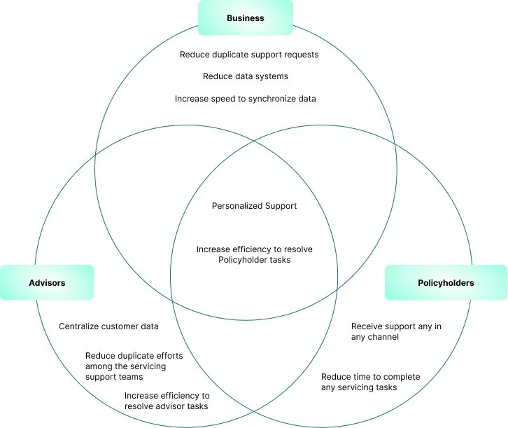
Scope
B2C, D2C, Cross-channel
Focus
Omni-channel servicing support
Personalized quoting experiences
Language preferences for omni-channel servicing
Role
Product Designer and UX Strategist
In this North Star initiative, I partnered with the Senior UX Lead designer, translating foundational research into a cohesive future-state vision. Collaborating closely with the Senior UX Lead on system architecture and the Senior UX Manager on business alignment, I prioritized top-tier servicing goals to streamline the customer journey. My work focused on bridging the gap between high-level strategic discovery and tactical UI/UX execution, ensuring a scalable and compliant path forward within a complex product ecosystem.
01 Opportunity
Prioritization
Repeated input / session-based flow snapshot
Empathy Map
Multi-channel servicing entry points
02 Landscape
Empathy Map
With the insights from the user interviews, I created an empathy map to synthesize user interview findings.
Research Synthesis
Once I organized all the interviews, I moved onto research synthesis. In this step, I sorted my notes into groups, which helped me identify patterns in participant responses. From these patterns, I extracted insights which were then translated into user needs.
Insights
01 Users do not want to quiet their inner critic
02 Users want to have the space to reflect daily
03 Users find ways to practice self-compassion
Needs
01 To confront self-criticism
02 To reflect daily
03 Practice self-compassion
POV Statements & HMW Questions
With the insights and needs derived from my empathy map, I created a POV statement and HMW question document. By combining user needs and insights, I created POV statements. To address user needs, I wrote a how might we question for each need of my user persona. These how might we questions would be used in the next step of my process, brainstorming.

03 Exploration
End-to-end servicing ecosystems
• servicing journeys
• front stage vs. back stage dependencies
• task switching patterns
Key insight
Users don’t think in products. They think in tasks.
Product Roadmap
Based on the findings from the methodologies brainstorming and the business and user goals analysis, I created a product roadmap to prioritize which features I would build first.


Application Map
I created an application map to understand how the app’s information architecture would be organized. The site’s content categories are based on the pages and features I listed as requirements. It was essential to outline the website’s structure before creating any designs to ensure that the app maintained its intended organization to best suit user needs.

Task Flow
In order to visualize how a user would interact with the site, I created a task flow. I created three tasks that would be typical of a user on our site.

User Flow
For a deeper look into how a user would navigate within the app, I created a user flow to anticipate behaviors and decisions a user might do during a specific task. This helped me visualize potential pain points that I could further identify during testing.

DESIGN
Low-Fidelity Wireframe Sketches
Based on my task & user flows, I started building out my first iterations of my low-fidelity wireframes. I used inspiration from competitor sites, design patterns, and our own user goals.
Mid-Fidelity Wireframes
From my sketches, I created mid-fidelity wireframes which I would use for testing.
04 Validation and Iteration
Usability Testing
I tested my prototype with five participants, in a moderated think aloud usability test. All testing was conducted over Zoom with the participant sharing their screen, so I could see the user’s interactions and reactions to the prototype.
Test Objectives
Is the language familiar to the user
Test the efficiency of completing a task
Determine areas of the app that are confusing, difficult to navigate, or are inconsistent
Observe if the site provides enough information for the user to understand the goals.
Test if users can complete their tasks successfully without the struggle
Explore the on boarding experience
Explore how to break the perfectionism block
Find out how to create your own practice
Mid-Fidelity Prototype
Using InVision, I created a Mid-Fidelity Prototype to conduct usability testing.
05 Building a Supportive Experience System
BRANDING
A visual language was developed embodying the brand message and attributes. I created a mood board to begin branding development.
Brand Message
Supports Mental Health
Promotes Autonomy
Encourages Self-improvement
Inspires Self-Compassion
Brand Attributes
Calming
Uplifting
Inspiring
Comforting
Loving
Brand Name and Logo
I created a word map with the brand message in mind and created a list with the word associations. From the list, I eliminated words that would disassociate from the brand message. Using the brand attributes for the the logo, calming and inspiring, and the brand name BEE, I created a visual mind map. Inspired from the visuals, I hand sketched and created vector drawings. I enjoyed the process! The final logo is a human sitting in a lotus position and the silhouette of a bee encapsulated in a honeycomb.
Style Tile
Based on the current trend of this genre of applications a wide range of gradients were used. The challenge was to create a color palette and typeface that passed accessibility requirements. I also tested these elements on some high-fidelity screens, which helped test all the components on
06 Key Learnings
Affinity Map
I synthesized my test findings in an affinity map to unearth patterns and behaviors. The users experienced so much confusion and frustration; I had to resist the urge to explain and clarify. The test unveiled how I needed to improve the design; there was much work to be done!
Summary:
5/5 Users expressed that the language was not clear
5/5 Users exhibited that the navigation was confusing
5/5 Users were overloaded with too many tasks
5/5 Users were unclear about my goals
5/5 Users questioned their completion of tasks

Mid-Fidelity Updates
Usability testing findings showed the problematic areas of the design. I revised the wireframes with the recommendations extracted from the affinity map.

High-Fidelity Wireframes and Prototype
With the UI Kit and visual design system complete, I integrated it into the wireframes. I selected some screens to test gradient options. I had to rework the gradients and update the Style Tile after testing the gradients for accessibility. After the visual design system was updated, I completed the high-fidelity wireframes and prototype.
My Takeaways
01 Keeping language relevant to all users is imperative. I was not cognizant of the language I was using in the mid-fidelity prototype, which caused the users to question the meaning of the phrases, and words that were used. To resolve this, I used the Hemingwayapp to check the level of language and then used a word map to simplify the language and verify the updates again with the resource. I repeated this cycle until the language used met the requirements. Going forward, I will verify the language before the testing phase.
02 Gradients are challenging for accessibility. Keep the gradients within the same saturation. Too much variance in saturation will be problematic for accessibility and the visual design system.
03 Goals for the project change as the users goals and motivations are unveiled through usability testing. I eliminated screens that were not relevant to the user and developed the screens that appealed to the user’s goals and motivations.
04 Mid-Fidelity Prototype testing helped verify the information architecture. Mid-Fidelity testing reveals inconsistencies early on! I realigned the information architecture to the needs and goals of the user.
Next steps
I would continue user testing to refine the interactions with the user. Since one of the main goals is to promote autonomy, I would like to test each feature over a 7- day period to track the efficiency of the goal building features.
Due to the time constraints, I did not have time to develop custom imagery and illustrations. If I were granted the time, I would develop icons and visual imagery specifically for the app.